Adtrend team
 01 Home
Most prop firm sites are a white-label template with a new logo: a home page, a pricing table and a FAQ, with the rest left to Discord. This guide lists the pages a prop firm site needs, what each one must do and show, and how it should work on a phone.
01Page
Home
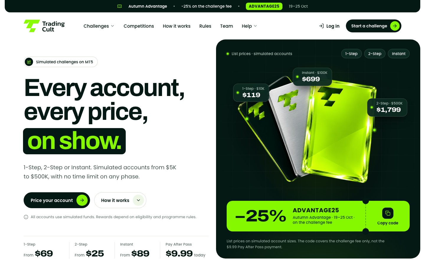
Its jobTell a trader in one screen what you sell, what it costs and where to start.
The home page is where ads, search and word of mouth land. It should not try to say everything; it should send each visitor to the right next page.
- What you sell in plain words: simulated challenges, with the programme types and account sizes.
- A "from" price and one main button to the account picker.
- The key rules as numbers: profit target, daily loss, maximum loss.
- How rewards work in one line, linked to the rewards page.
- The company name and address in the footer, and proof a trader can check.
On the phone
Headline, one price and one button in the first screen. No banner slider.
Common mistake
Sale banners, countdowns and pop-ups before the trader has seen a single rule.
02Page
Programme pages
Its jobAnswer "what do I have to do to pass, and what does it cost?" for one programme.
One page per programme: 1-step, 2-step, instant, pay later, or whatever your line-up is. Each one can rank for its own searches and gives ads a precise page to land on.
- The phases, with the profit target and loss limits of each.
- Minimum trading days, time limit, leverage and anything special to this programme.
- The price for every account size.
- What changes once the trader is funded: reward split, request cycle, rules that switch on or off.
- A buy button that carries the programme into the account picker or checkout.
On the phone
Rules as stacked rows with the number first, and one tab per phase.
Common mistake
Five programme pages with the same text and only the numbers changed, or rules that live only in a PDF.
03Page
Compare
Its jobPut every programme side by side so the trader can decide.
- One column per programme and the same rows in the same order: price, phases, targets, daily and maximum loss (static or trailing), minimum days, consistency rules, reward split, first reward.
- An account size switch that updates every price.
- A short "which one fits you" guide in plain words, without "easiest" claims.
- A button under each column.
On the phone
Don't squeeze five columns into 390 pixels. Let the trader pick two programmes, or stack one card per programme.
Common mistake
Comparing yourself with other firms by name, with claims you can't back up.
04Page
Account picker and prices
Its jobLet a trader build the exact account and see the final price before checkout.
It can be its own page or a block on the home and programme pages. Either way, it is where the buying decision is made.
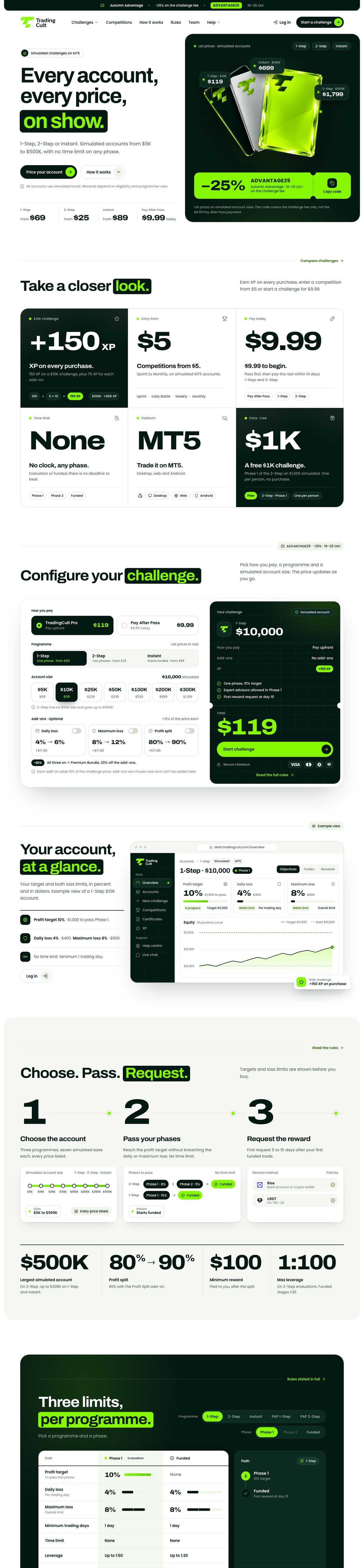
- Programme and account size as simple choices.
- Add-ons with their price, switched off by default.
- Any discount code shown as already applied, with the price before and after.
- For pay-later programmes: what is paid today, after passing, and in total.
- A button that carries every choice into checkout.
On the phone
One choice per row, big tap targets, and the total right under the last choice.
Common mistake
Prices that only appear in checkout, or a code the trader has to type in again.
05Page
Rules
Its jobThe full rulebook, per programme and phase, in plain words.
Traders read the rules before they buy and again every time something goes wrong. It is also the page your support team will link to again and again.
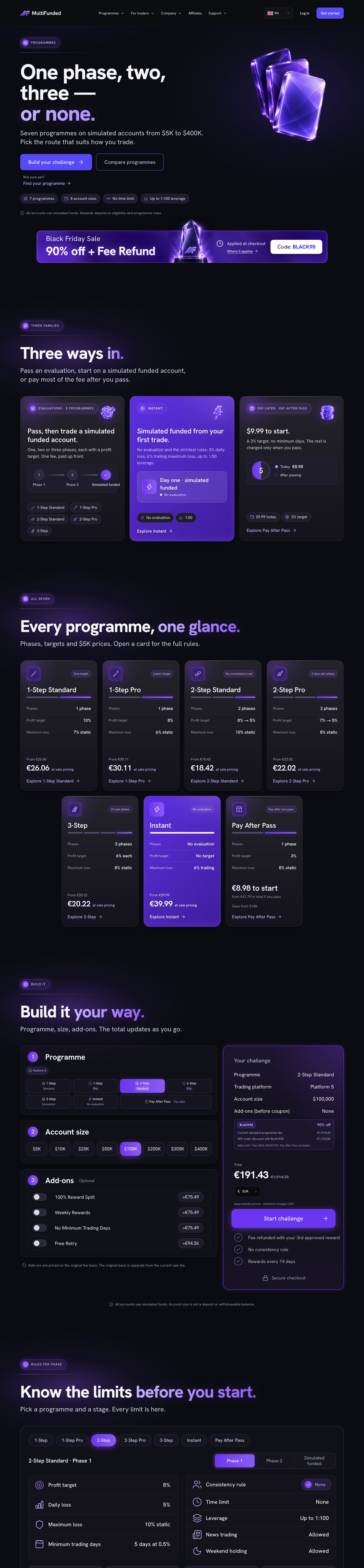
- Daily loss: how it is measured and when it resets.
- Maximum loss: static or trailing, and from what level.
- Profit targets, minimum days and any consistency rule.
- News trading, weekend and overnight holding, EAs and copy trading.
- What closes an account, and what is not allowed.
- When the rules are locked: at purchase, or can they change?
On the phone
Tabs or accordions per phase, with the number in the first line of each row.
Common mistake
Rules spread over the FAQ, the terms and Discord, with different numbers in each place.
06Page
FAQ and help centre
Its jobAnswer questions before support has to.
- A FAQ page with the 20 to 25 questions traders ask most, grouped by topic.
- A help centre for depth: getting started, programmes, rules, rewards, billing, verification, platform.
- Search on both, and a clear route to a person: live chat, email or Discord.
- Answers that link to the rules page instead of repeating its numbers.
On the phone
Search at the top, topics as chips, short answers that open one at a time.
Common mistake
One accordion with 80 questions, and answers that disagree with the rules page.
07Page
Rewards
Its jobExplain how and when a funded trader receives rewards.
- The reward split, and what add-ons change.
- When the first request can be made, and how often after that.
- Review and processing times the firm can keep.
- The conditions: identity check, rules respected, minimum days.
- How rewards are sent, and when the challenge fee is refunded, if it is.
Use the words "rewards" and "simulated accounts". Leave out payout counters and screenshots: on Meta they run into the rule against referencing past returns (see prop firm advertising rules in 2026).
On the phone
A timeline from first funded trade to first reward reads well as a vertical list.
Common mistake
A wall of payout screenshots and a "paid out" counter.
08Page
Checkout hand-off
Its jobGet the trader from "Buy" to a paid account without choosing again.
Many prop firms run checkout inside their trader dashboard, on its own subdomain. The website's part is the hand-off.
- Buy buttons that pass the programme, size, add-ons and code in the link, so checkout opens with them already picked.
- The same total on the site and in checkout.
- The terms checkbox unticked, and any marketing opt-in separate and unticked.
- Payment methods shown before the last step.
- What happens next: login details, platform, first trade.
On the phone
Short forms, the right keyboard for each field, and the order total right above the pay button.
Common mistake
Buttons that open an empty checkout, so the trader has to pick programme and size again.
09Page
Affiliates
Its jobRecruit partners with the real terms.
- Commission rates and tiers, and how a partner moves up.
- Cookie length and how sales are tracked.
- When and how commission is requested.
- What affiliates must not do: income claims, fake reviews, or bidding on your brand name if that is your rule.
- An application form.
On the phone
Tiers as stacked cards, with the apply button after each section.
Common mistake
Earnings projections such as "top partners make $10K a month".
10Page
Legal and risk
Its jobProtect the firm, and tell traders the truth about what they buy.
- Terms and conditions, privacy policy, refund policy, and a cookie policy with a consent banner that works.
- A risk disclosure that says plainly that the accounts are simulated.
- An AML and KYC policy: when identity is checked and what is asked for.
- The company name and address. Google asks advertisers of financial products to show the address.
Keep legal pages readable: a table of contents, numbered sections and a date.
On the phone
Contents as a drop-down at the top, then one column of text.
Common mistake
Policies copied from another firm with its name still inside, or a cookie policy that doesn't match the tags on the site.
11Page
Blog
Its jobAnswer the searches the firm can actually win.
Searches like "best prop firm" belong to comparison sites. A firm's own blog can win its brand searches and the questions traders ask about its rules: how daily loss works, static against trailing drawdown, your firm against another.
- Articles that explain your rules with worked examples.
- A date and an author on every post.
- A link from each post to the programme or rules page it explains.
Fewer, better posts. Google's spam policies name "scaled content abuse": many pages made mainly to manipulate search rankings.
On the phone
Readable text size, and tables that turn into cards.
Common mistake
Sixty machine-written posts that no page links to.